Journey 3
Editing & approving.
From a saved draft to a fully approved piece, with multi-stakeholder workflow.
Content list
All saved content lives at /content. The header is sticky on scroll; filter tabs (All / Draft / Review / Approved / Scheduled / Published) sit underneath. The table shows title, type, status, and updated-at.
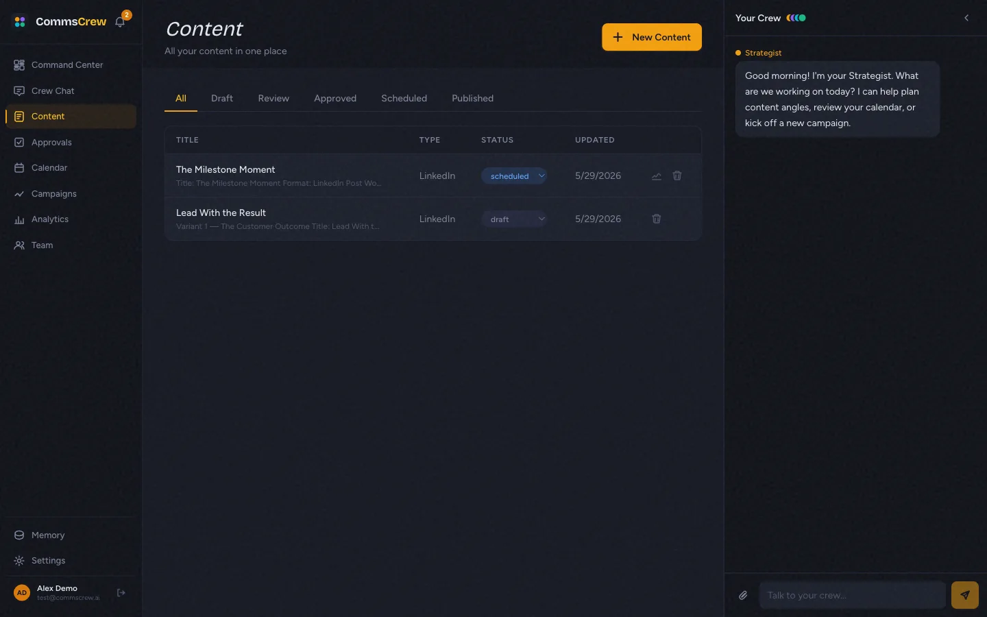
Each filter is a query param. Linking to /content?status=approved deep-links to the approved tab — useful for notifications and cross-page CTAs.
Content detail page
Click any row to open the detail page. The top bar (sticky on scroll) shows breadcrumb, status dropdown, an animated brand voice score ring (color-coded by tier — red/amber/emerald), and action buttons. The body editor is below, with the original brief, all generated variants, and a comments thread at the bottom.
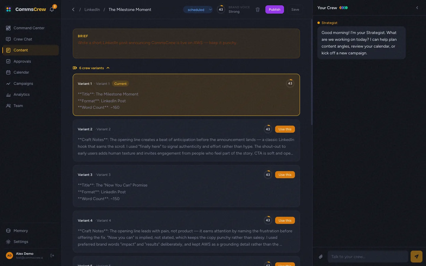
Each variant has its own brand voice score. Click Use this on a variant to swap its body into the main editor and mark it as the selected one.
Send for review
Status draft shows a Send for Review button in the top bar. Clicking opens a modal for an optional note to the reviewer. Submitting transitions the content to review, creates a ContentApproval row, and fires notifications (in-app bell + email + Slack if configured).
Approval queue
Reviewers go to /approvals. Each pending item shows a body preview, a type badge, and Reject / Approve buttons. Approving transitions status to approved; rejecting requires a reason and bounces back to draft.
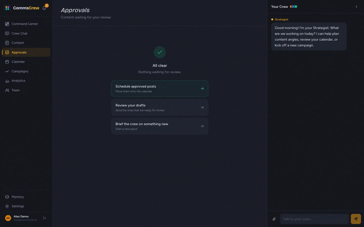
The empty state is intentionally designed as a workflow handoff: rather than just “All clear,” it offers three forward CTAs (Schedule approved posts → / Review your drafts → / Brief the crew →). This was a cohesion fix from the workflow audit — empty states should be entry points, not dead zones.
Honest limitations
- External approvers without seats — not built yet. The pitch is tokenized review links for legal / board / outside agencies. The data model supports it; the UI for sending a tokenized link does not. This is one of the wedge features and a priority on the roadmap.
- Parallel approval chains — single-reviewer only. If you want legal + exec to both approve before publishing, you can’t express that today. Linear sequence of one approver.
- Comments are flat. No threading, no @mentions, no inline comments on a specific paragraph. A single comments list at the bottom of the detail page.
- Audit log export — not built. Regulated industries (financial services, healthcare) need timestamped approval trails for compliance. The data is captured; the export endpoint isn’t.
Next
Scheduling →
Pick a date, see it on the calendar, transition to published.